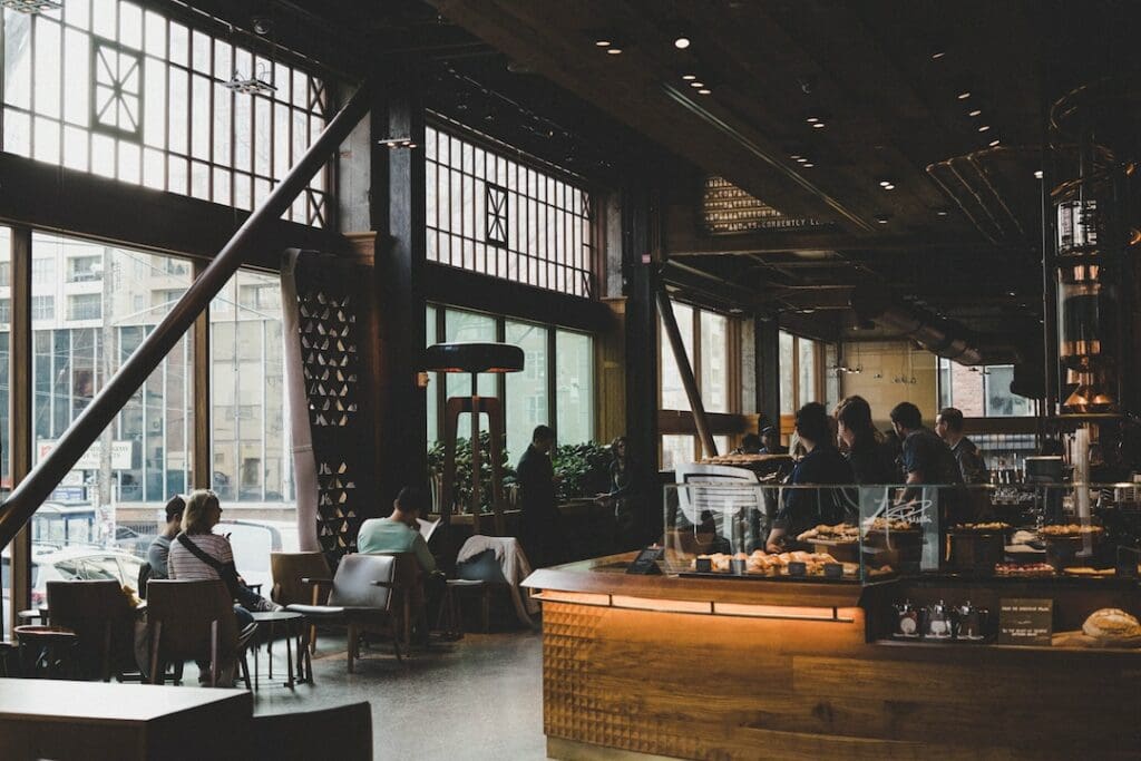
Starbucks burst onto the scene in the 1970s, offering an update on the coffee shop template. After successfully running a coffee shop in Seattle, USA, the company set their sights on expansion.
They invented a new form of coffee shop usage, now known as “coffee camping”. Customers wanted a place to be able to sit, relax, catch up with friends, read a book or even work. It’s a location between work and home we refer to as the “third space”.

By offering a comfortable space, they could justify a heavy markup on their coffee prices. This was no longer a place to buy a humble cup of coffee; it was a whole experience with distinct decor and a soundtrack to match. The concept was so successful that there are now over 38,000 Starbucks locations in 80 countries around the world. Starbucks is one example of successful sensory marketing in action.
It’s odd to think about Starbucks creating something that is now so recognisable and commonplace in our culture. But it’s an important aspect of interior design that is often overlooked.
You can create a place that people want to visit, but how do you make them want to sit and stay a while? When customers feel comfortable enough to dwell in a venue, you’ll find that their average spend increases.
We see this in hotels, where there is a lot of additional revenue to be made in the hotel bar and restaurant. But only if you can convince visitors that this is more desirable than being in their room.
It can mean the difference between the guest enjoying a three-course meal with wine in the hotel restaurant versus a single bottle of wine ordered to their hotel room. During the day, guests have a choice between enjoying a coffee and pastry in the hotel lobby or heading to a nearby competitor.
What is dwell time?
Dwell time or dwell rate is a term used in interior design to describe the time customers spend in designed spaces. Hotels and hospitality venues are particularly concerned with the dwell rate.
It’s vital to strike a balance between creating a space where people feel welcome to sit, relax and enjoy their time, while also recognising that it is a commercial space and they are expected to spend money while they are there.
Many coffee shops struggle despite seemingly being very crowded during the day. This is because they create an atmosphere where workers feel welcome to purchase a single drink and then occupy a table all day long. Design should be comforting and welcoming, but it should also be clearly a commercial space.
How does dwell rate impact revenue?
A hotel I recently stayed in would be the perfect example of a missed opportunity in design. The hotel was built in the 1800s and had a stunning exterior, but a recent interior refurbishment created a disjunction between the original features and the new design.
Despite being a high-end hotel, nothing about the interior invited me to stick around longer than I needed to. Clashing wallpaper was paired with piercing and stark lighting that cheapened the interior. The seating also looked cheap and was incredibly uncomfortable. As I looked around the lobby, I couldn’t find a reason to stick around and instead sought refuge in my hotel room.
So, what did the hotel get wrong?
There are a few design elements that will have a huge impact on the dwell time of your hospitality venue. These are:
Furniture
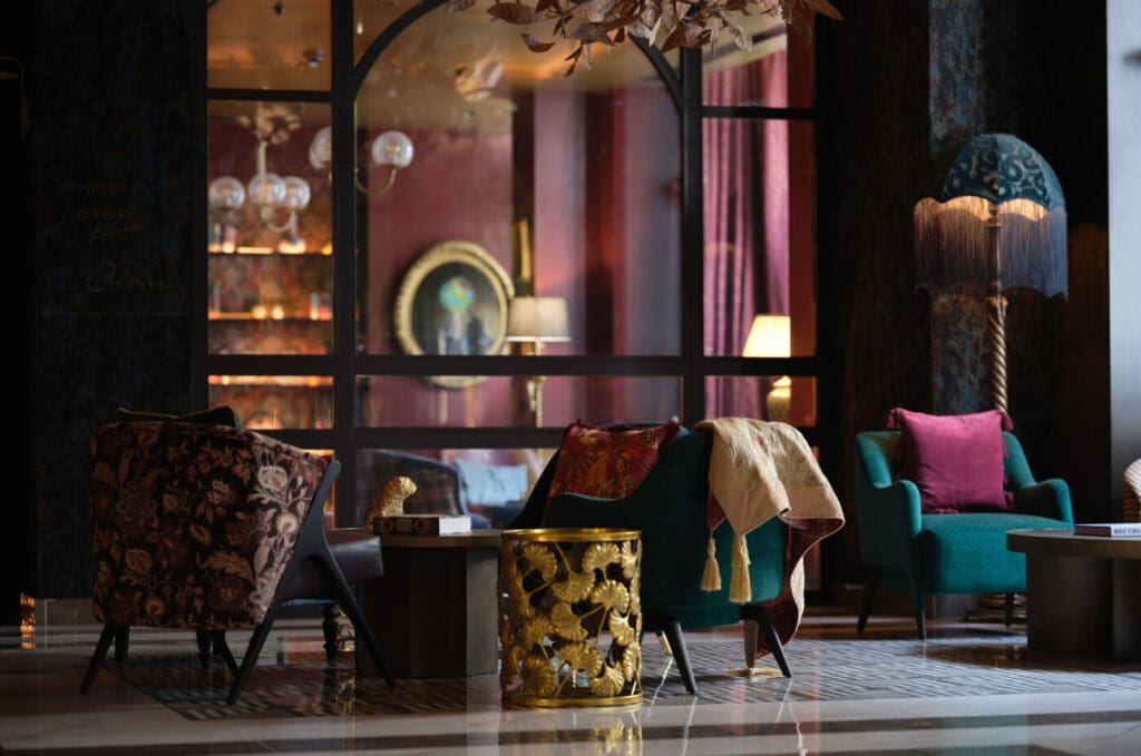
It’s really as simple as this: if there is nowhere comfortable to sit, don’t be surprised if people don’t stick around. Offering a variety of options is a highly successful design choice that allows people to find something that works for them. Some people feel more comfortable lounging, others prefer a supportive chair and others like to perch on a bar stool.
One example that springs to mind of venues getting this right is The Other House in Kensington, London. This venue combines apartment-style living with all the services you would expect from a luxury hotel. This location offers plush, dramatic interiors that invite you to sit and lounge around all day.

Decor
Decor should be sympathetic to the original features and provide cohesion between the exterior and the interior. It should also meet the visitor’s expectations in terms of quality. Put simply, high-end venues need high-end and on-trend decor. Try including elements of the local culture to create an immersive experience.
A great example of this would be our recent work with Dhillon’s Lounge. The focal point of the decor is a large mural showcasing the heritage of the town. It helps to bring together the distinct sections of the very large venue and provides a sense of cohesion.
Studies have found the use of colour in luxury interiors is very important to customer perception. Specifically, each dimension of colour (hue, saturation and value) will play a role in the customers’ aesthetic perceptions, emotional states, and behavioural responses.
Lighting
Stark, harsh lighting will always be a deterrent to individuals wanting to stick around. And this includes harsh sunlight. Large windows can be welcoming, but if the sunlight is blazing in and visitors feel like there is nowhere to hide from it, they’ll go looking for another place to spend their time (and money). Think about window treatments for light control alongside multiple lighting sources that can be adapted to the time of day.
Scent
Yes, you need to employ all of the senses when it comes to increasing dwell time. Overpowering smells will not create a welcoming environment. Multiple studies have found that pleasant ambient smells will increase dwell time in leisure and retail environments.
Work with us
If you are a luxury brand in need of a refresh, we’ve got you. Get in touch with our team today to learn how we can breathe new life into your hotel, bar, restaurant or other venue and transform it into a must-visit destination.


