The client – House of Dental, a mixed NHS and private dental practice in Hinckley, Birmingham – had a singular vision which resonated with Leanne as someone experienced with creating spaces to enhance wellbeing.
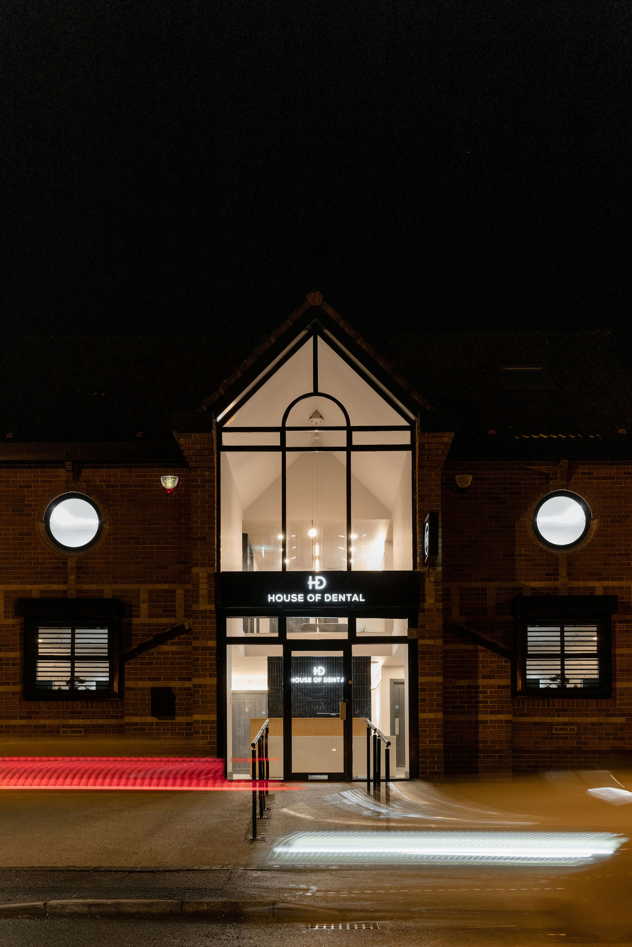
The brief centred around reducing missed appointments, which cost dental practices thousands every year. Non-attendance also has an impact on patients’ oral as well as overall health. It’s quite common for patients to feel anxious about going to the dentist, so we wanted the space to reference a hospitality or hotel setting, and for the décor to put patients at ease from the moment they entered.
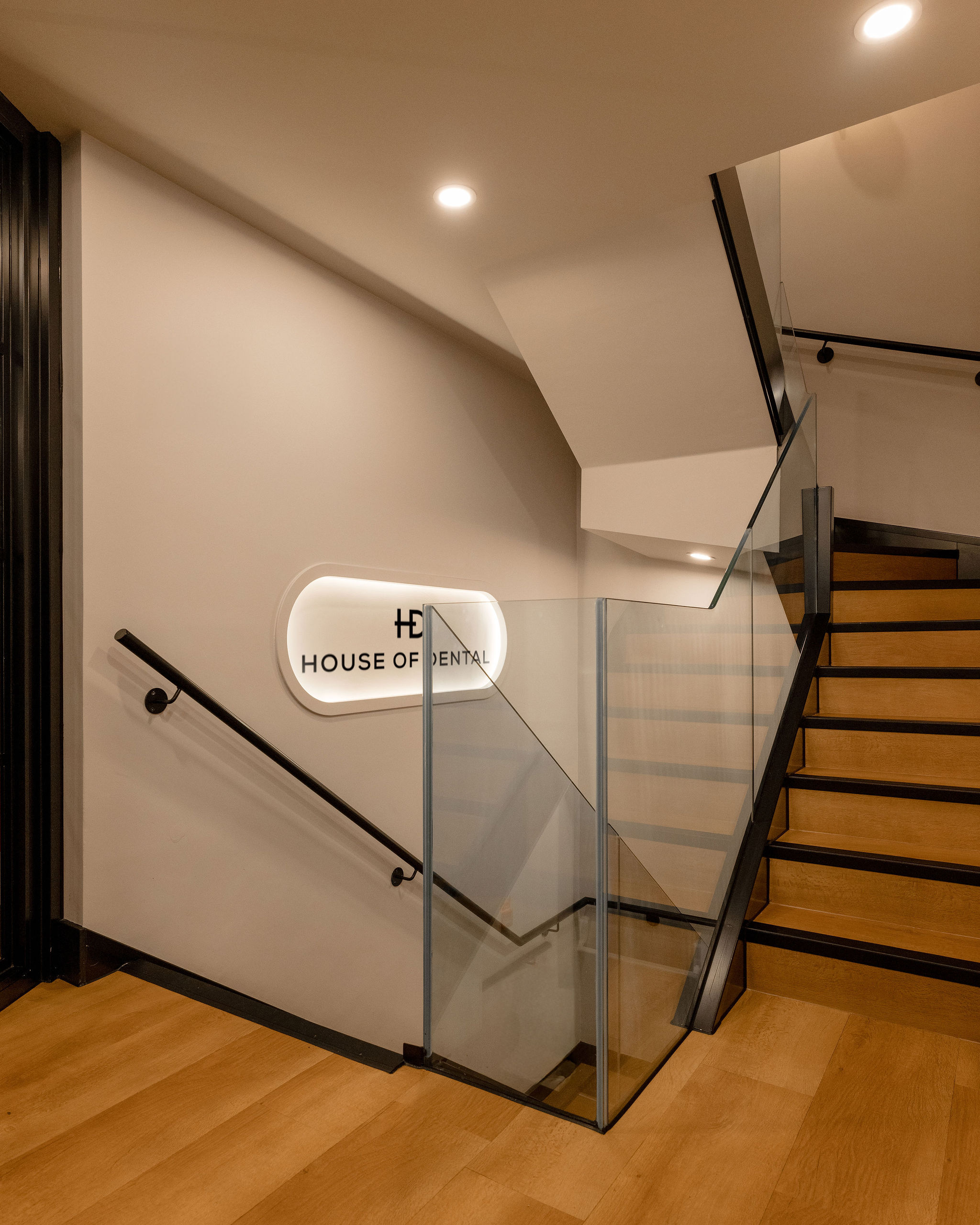
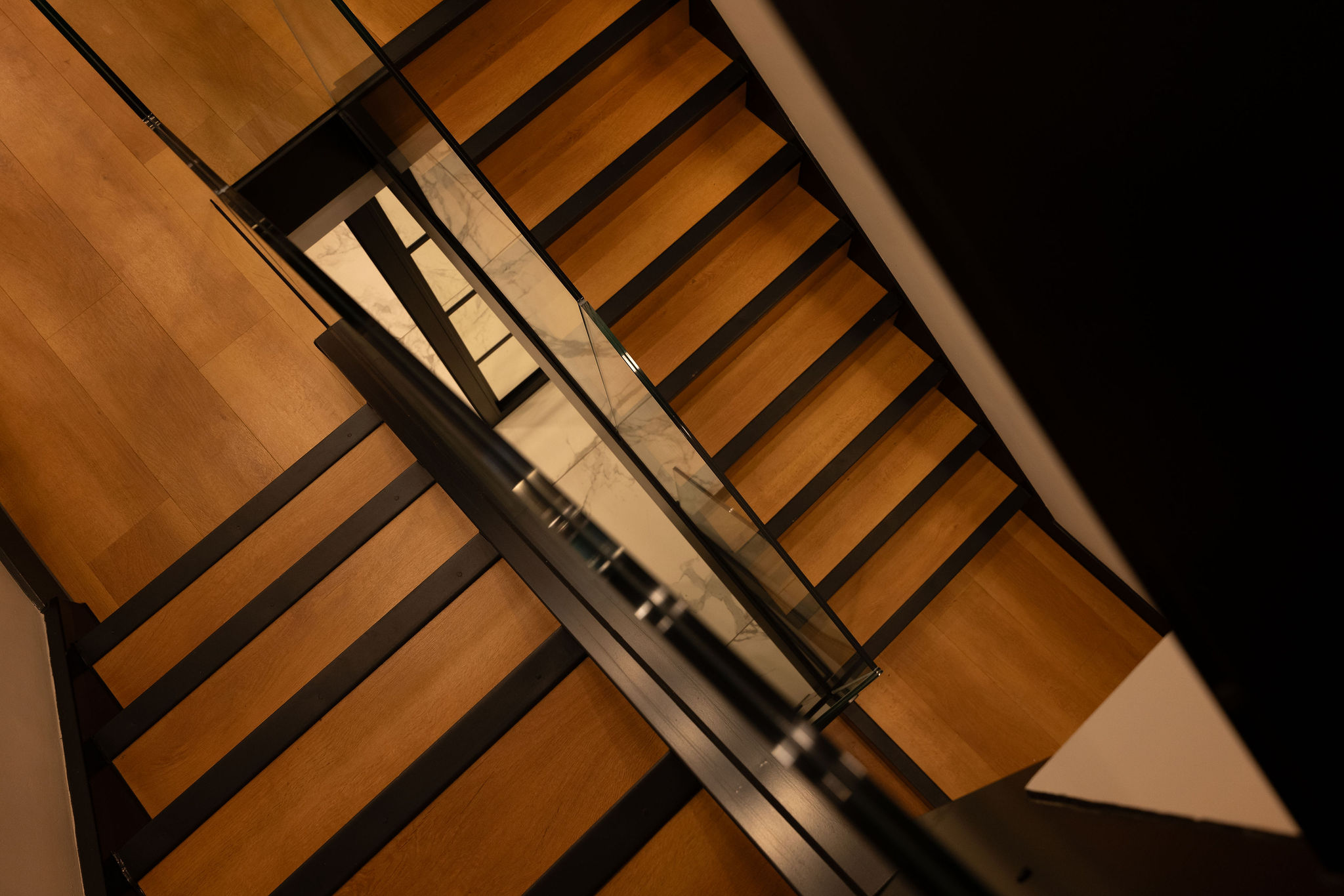
From the initial planning meeting, it became clear that Black Ivy Design would have to stage the works very carefully. Due to House of Dental offering NHS treatments, the practice had to remain operational throughout the project. The project included removing walls, building a balcony and moving the main staircase. This meant we had to be clear on logistics from the outset.
We collaborated very closely with the client on a communications strategy, and scheduled construction activities during out-of-hours and creating temporary partitions to maintain a safe and welcoming environment throughout the works.
The studio had to learn the dental regulatory system very quickly – it’s essential to know this framework. It was complex but we always put a great deal of energy into researching every industry-specific detail before putting any project into motion.
Black Ivy Design has designed for multiple hotels, bars, coffee shops and leisure and retail spaces. Leveraging this experience, we used principles of hotel design to meet the complex redesign brief for a busy dental practice.
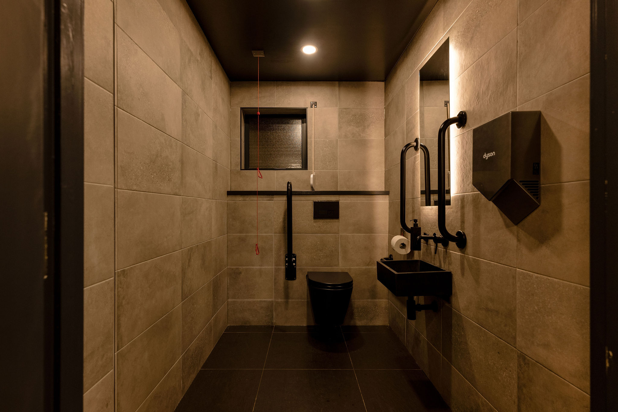
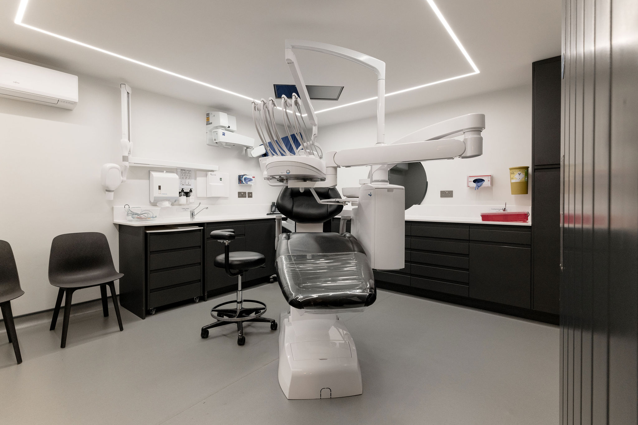
We had to learn how to design from a clinical point of view. For example, we had to consider where metal sheets would need to be positioned for the X-rays, what we could do with the walls and how easy this would be to wipe down. We had to consider the impact of very high patient traffic, and how staff needed to use the spaces productively.
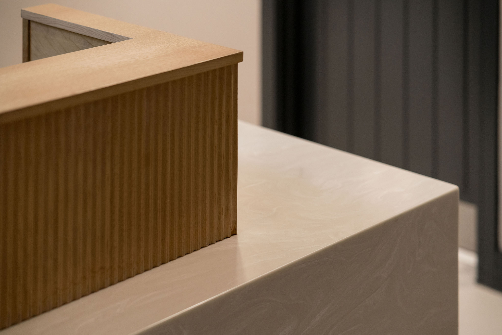
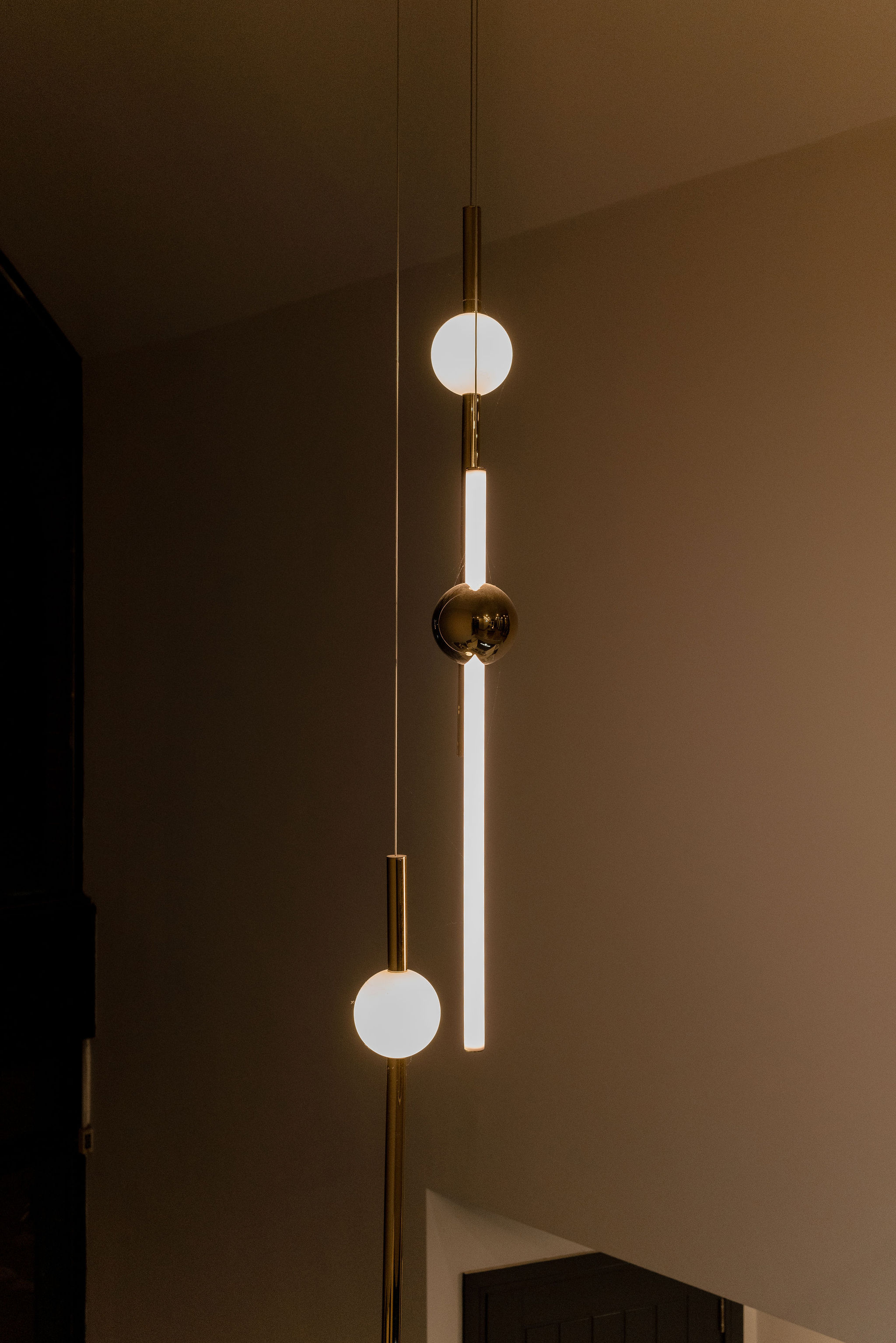
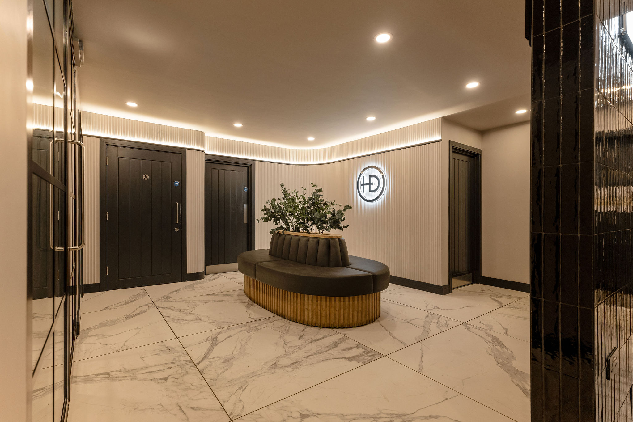
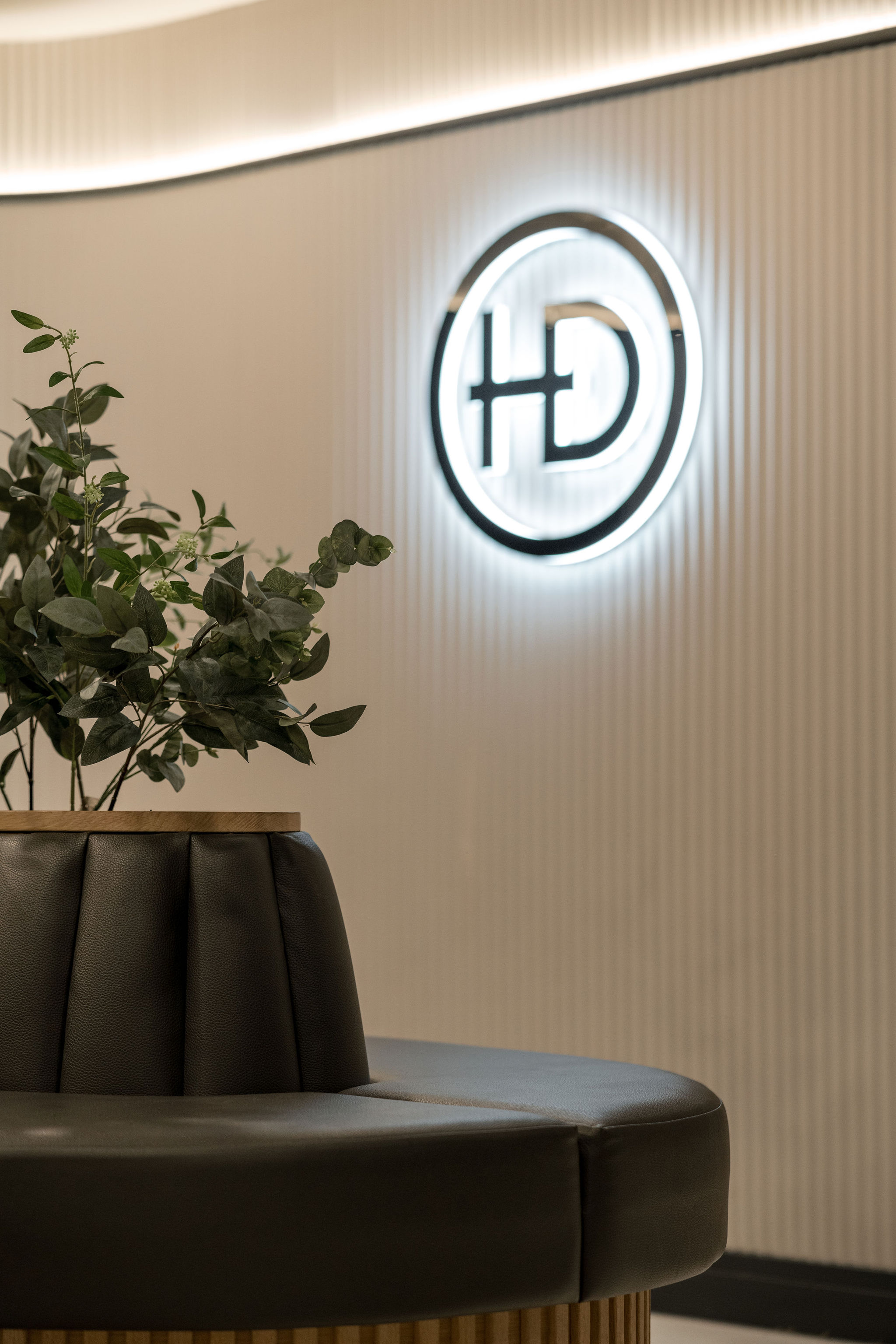
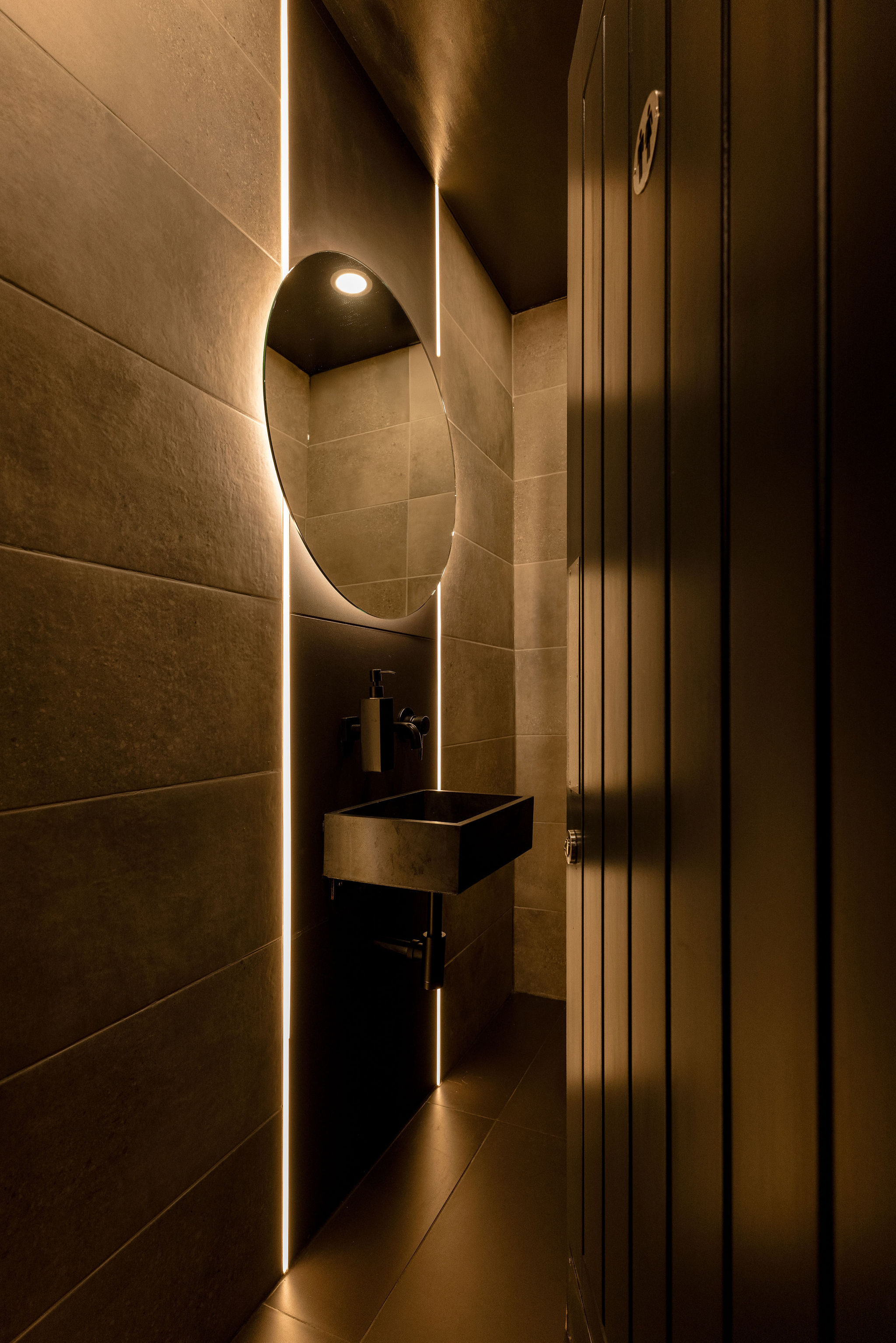
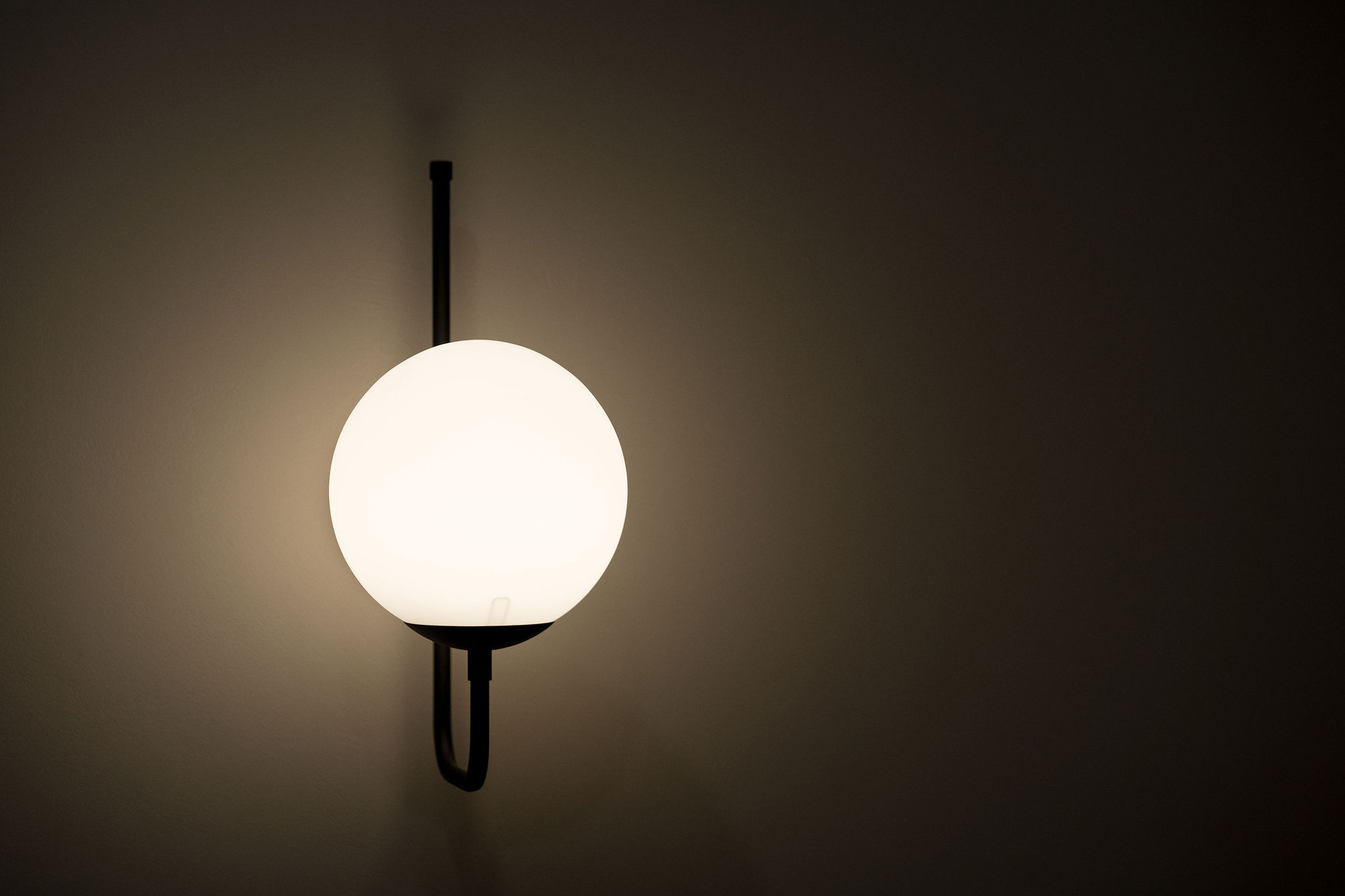
We wanted to focus on patients and materials rather than any trends. The focus was on creating a wellness space where the design makes people feel more like guests than patients. We chose neutral off-white tones and marble, complemented by greenery and centrally placed dark seating for the reception area. A contrasting partition with lit signage at the entrance added a touch of luxury.
To move away from the traditional white clinical look while enabling the practice to maintain optimal hygiene, clean lines and polished marble was complemented by warm lighting and dark cabinets.
The clients were thrilled with the results, and so are their patients. Patient attendance and satisfaction have significantly improved since the renovation. It looks and feels like a comfortable and serene social space.